A&M Immigration Multi Service
Immigration logo reimagined
A strong logo is not the entire brand. It is the signature that helps the whole system become recognizable.
Selected projects
Explore the thinking, details, and applications behind these marks.
Immigration logo reimagined
Insurance brand identity
Financial brand identity
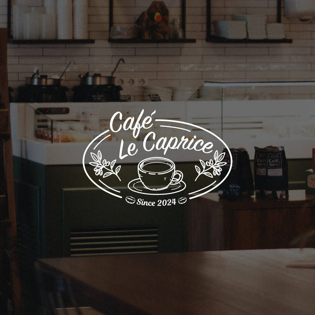
Modern café branding
A useful logo has to do more than look polished in a presentation. It should express the right idea, stay recognizable at different sizes, and give the broader identity a dependable visual anchor.
We shape these capabilities around the recognition problem, the applications that matter first, and the identity the business needs next.

We define what the mark needs to communicate, who needs to recognize it, and where it has to perform before visual exploration begins.

We develop distinct ideas with a clear reason behind each route, then evaluate the strongest direction instead of decorating random sketches.

We refine the selected idea into the configurations, color versions, and scale behaviors it needs to stay recognizable in real formats.
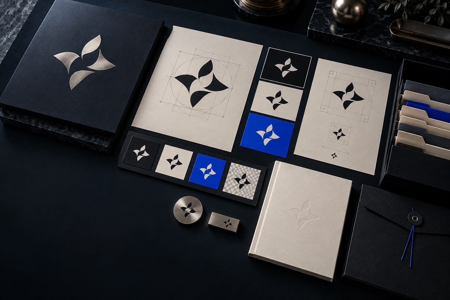
We prepare the approved artwork for its priority uses and organize practical guidance so the mark can be applied consistently after delivery.
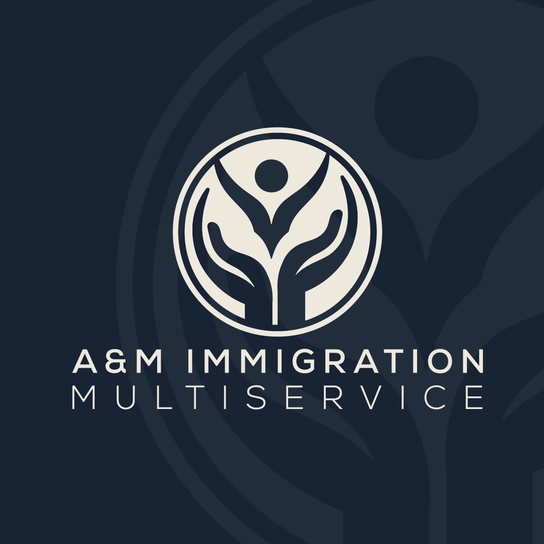
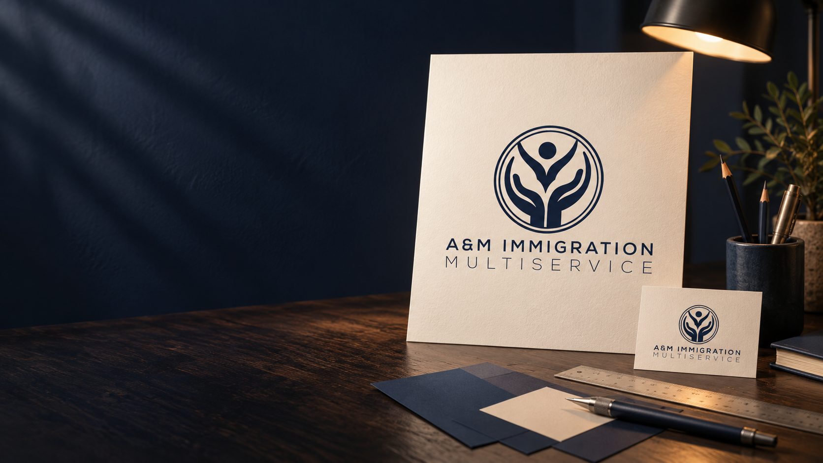
For A&M Immigration, the circular signature keeps its character across the core lockup, printed collateral, and a larger environmental application.
Common projects include first professional logos, thoughtful redesigns, legacy-mark refinements, responsive logo systems, and signature families for growing service and product businesses.
The depth changes with the project, but every engagement moves from a clear brief into a tested, prepared logo system.
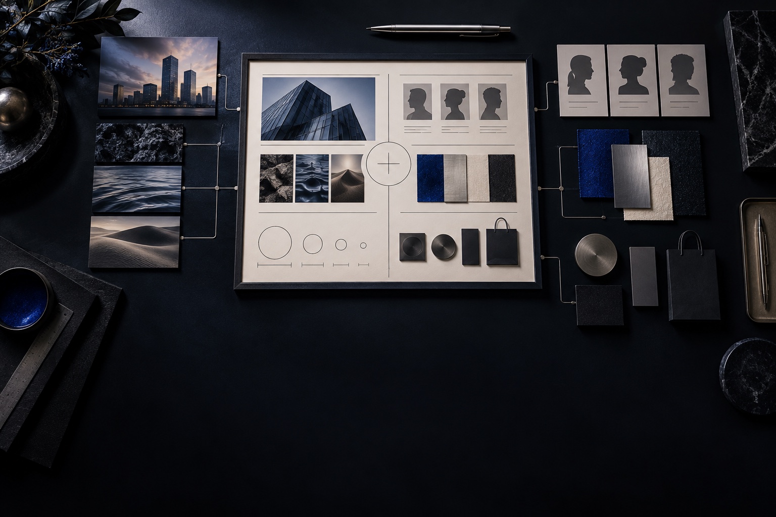
Clarify the business, audience, category, personality, practical uses, decision makers, and criteria for a useful mark.
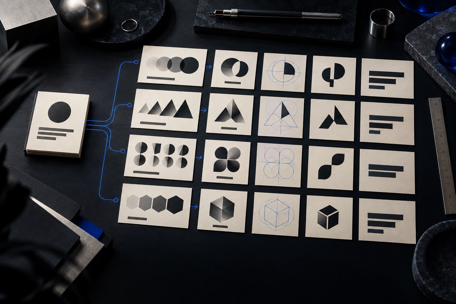
Generate distinct visual ideas, symbol structures, and wordmark relationships around the agreed creative criteria.

Compare the strongest territories by meaning, distinction, legibility, adaptability, and fit with the business.
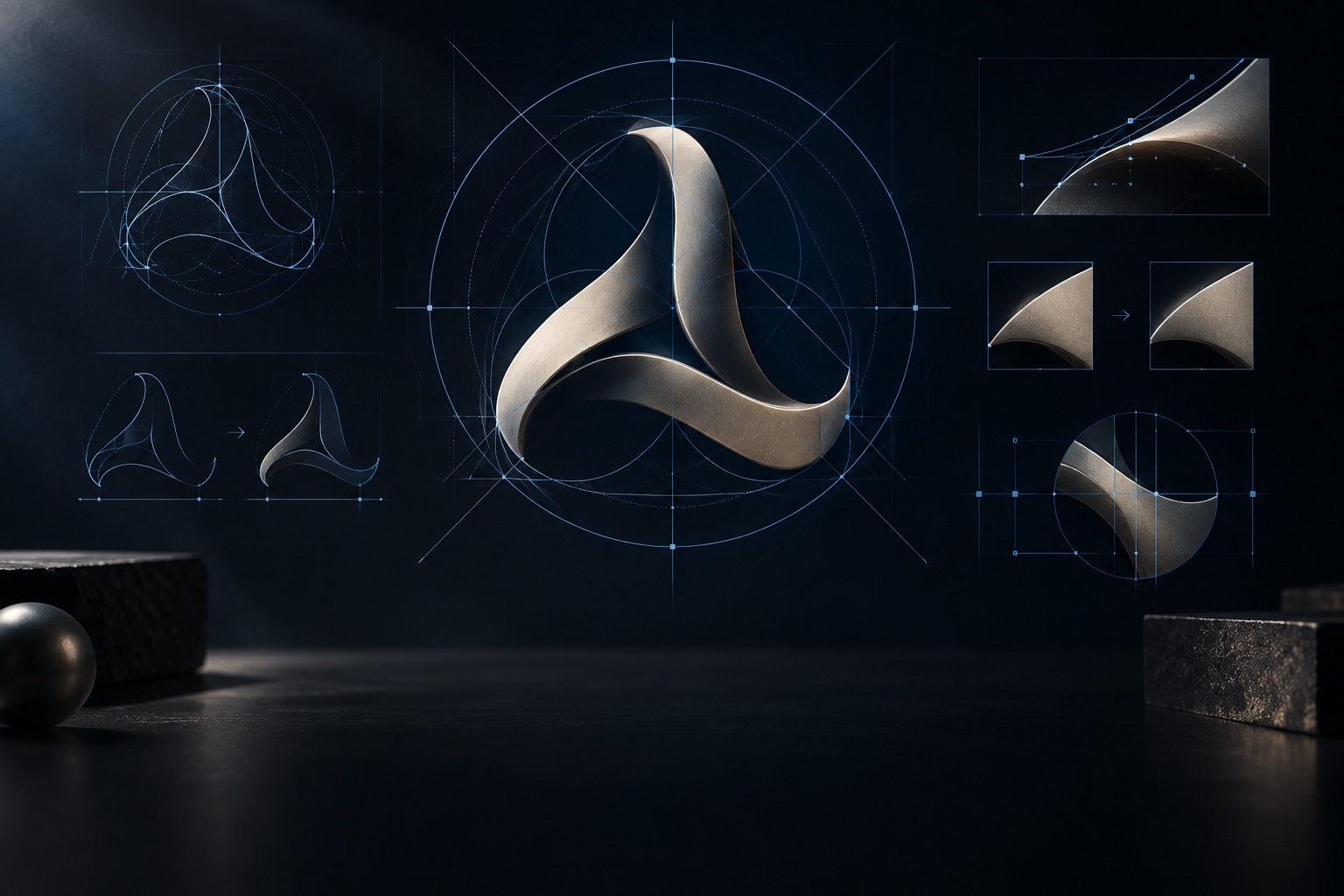
Resolve proportion, spacing, drawing, typography, and optical balance around the selected direction.
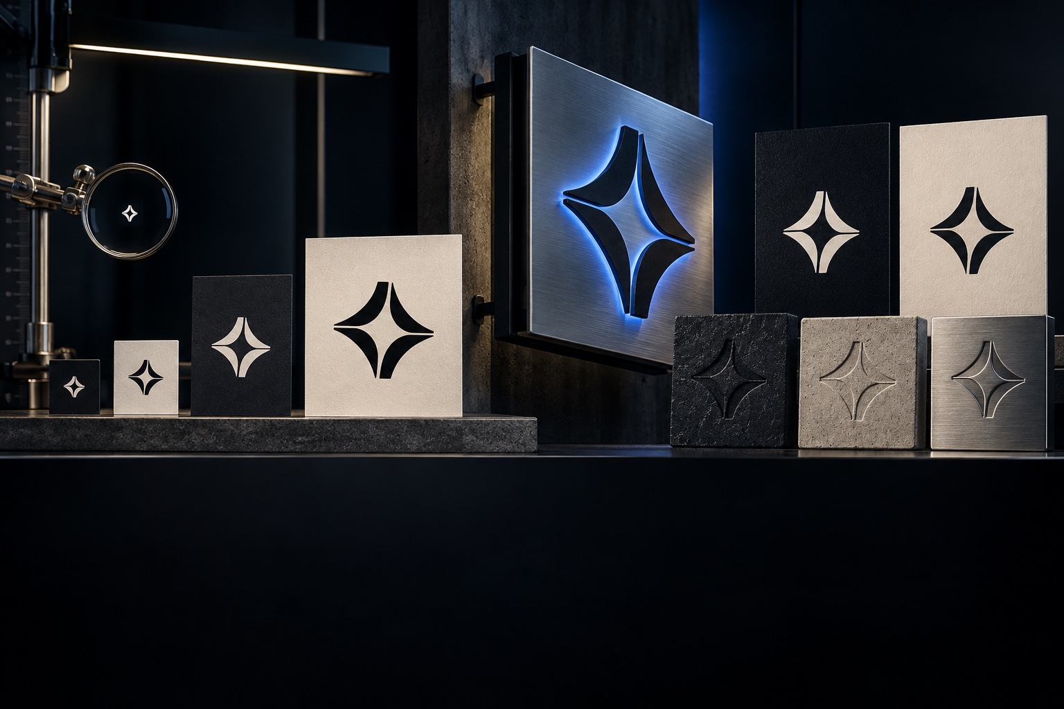
Check the system at small sizes, in one color, on light and dark surfaces, and across the priority applications.
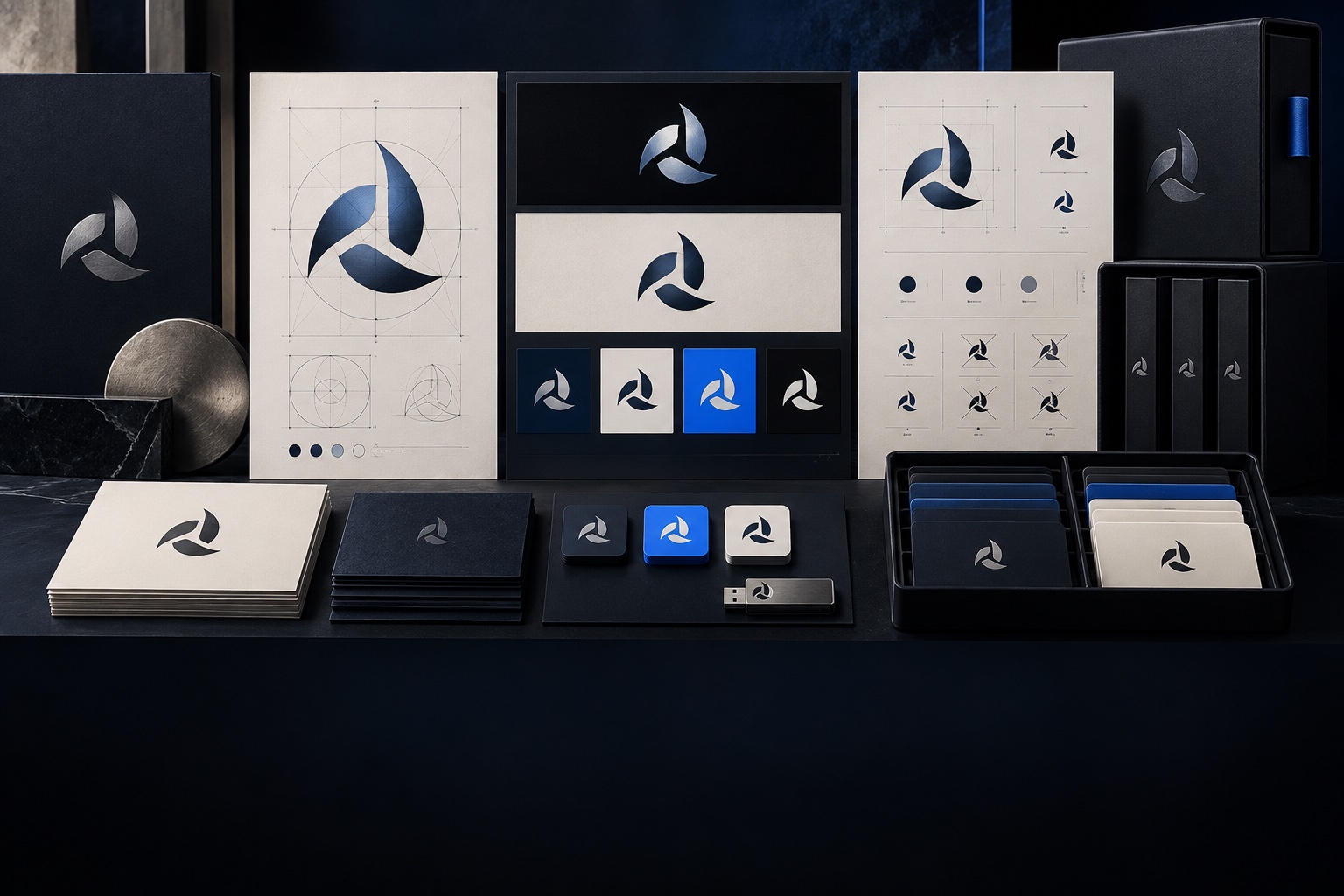
Build the approved configurations, export the agreed file formats, document essential rules, and hand off the system.
No. A logo is the recognizable signature within a larger brand system. Positioning, messaging, color, typography, imagery, voice, and the experience around the business shape the broader brand.
Yes. We first assess what equity is worth preserving, what is limiting recognition or use, and whether a careful refinement or a more substantial redesign is the right move.
The number of territories, review stages, and refinement rounds is defined in the approved scope. We present purposeful directions with clear criteria so feedback stays focused on the business decision.
We can perform preliminary visual and market scans when scoped, but formal trademark searches, clearance, and legal advice require a qualified attorney. Naming is a separate scope unless explicitly included.
Delivery is planned around the approved uses and can include common vector, print, digital, transparent, color, and one-color formats, along with the configurations and essential usage guidance in scope.
Yes. Color, typography, imagery, graphic language, templates, website design, social content, signage, packaging, and other applications can be developed as a connected identity phase.
Tell us what the business should be known for, where the current logo falls short, and which applications matter first.

BLENDIN CREATIVE